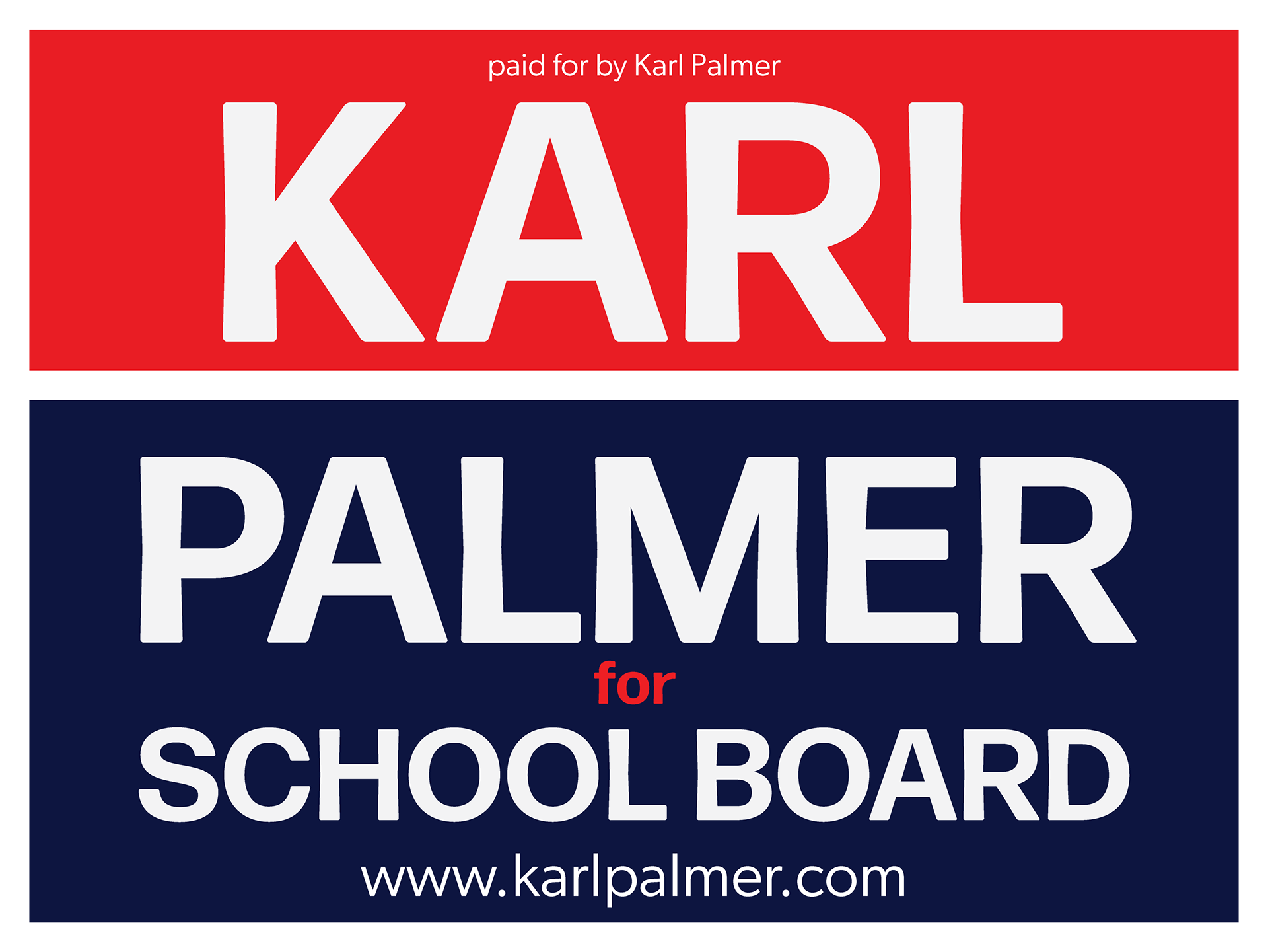
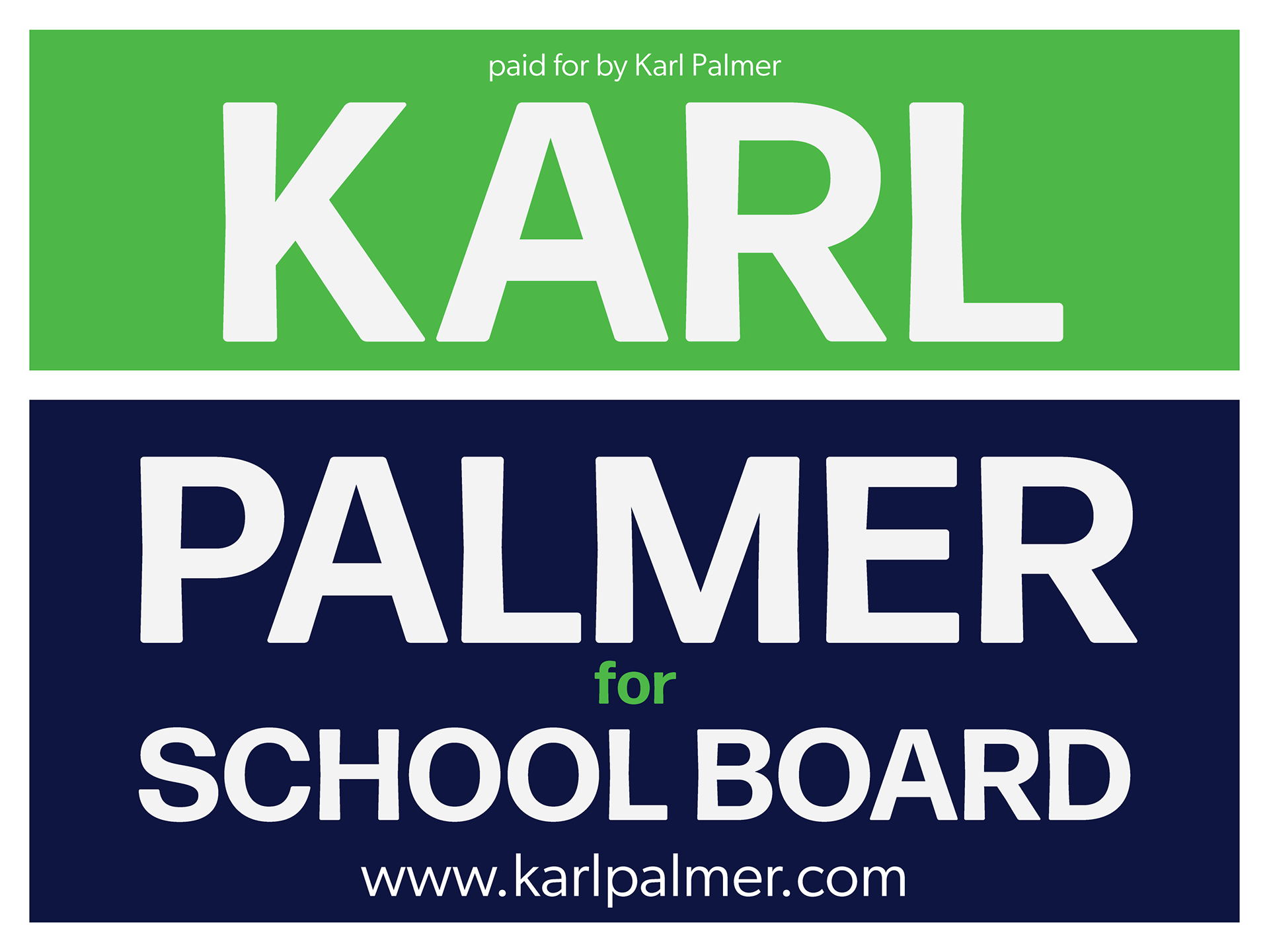
When we launched the Karl for School Board campaign, we knew we wanted to make a sign that was highly visible, given the timing of the campaign in a snowy spring. We wanted to make his name quickly recognizable. We tinkered with colors, knowing we did not want to be either red or blue, given Karl's great ability to bridge party lines, and the nonpartisan nature of school boards. In the end, we went with a nearly-red orange and navy. Insiders knew it was the colors of a specific bike belonging to a rider in our group. For most, it still reads red and blue, which is probably OK—the line between his names further symbolizes and perhaps subconsciously suggests Karl's gifts of walking the line to see all sides of an issue.
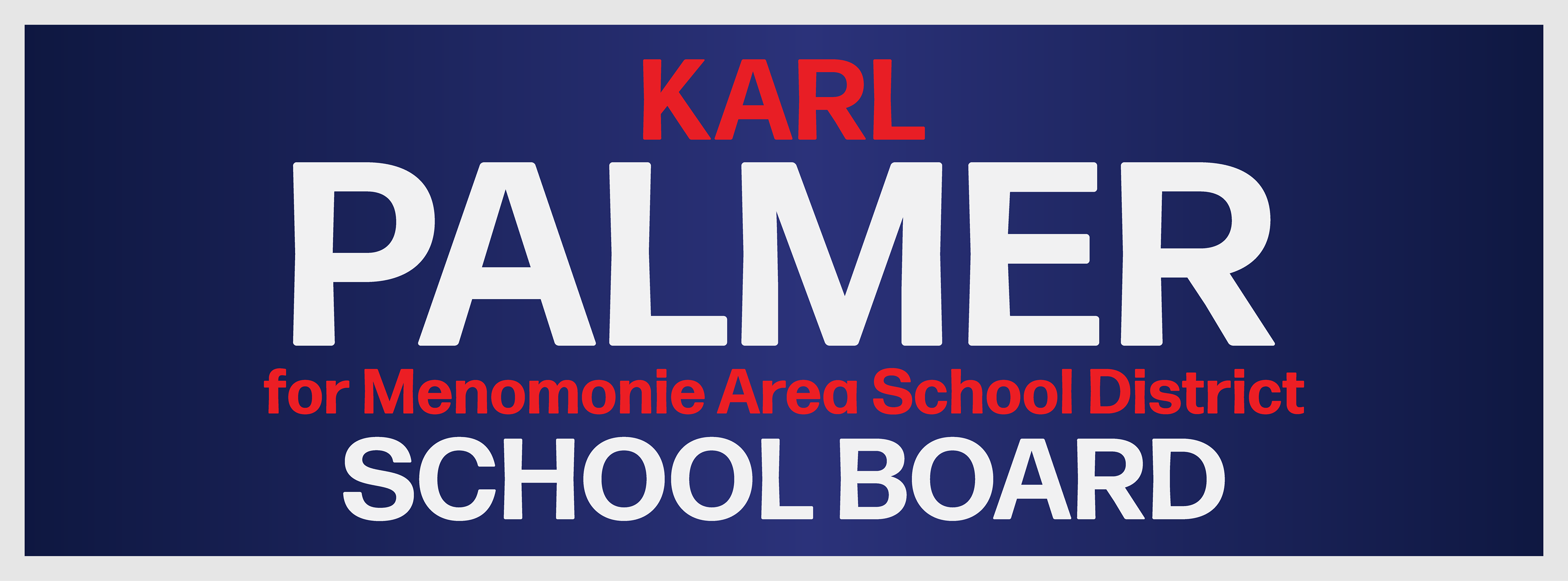
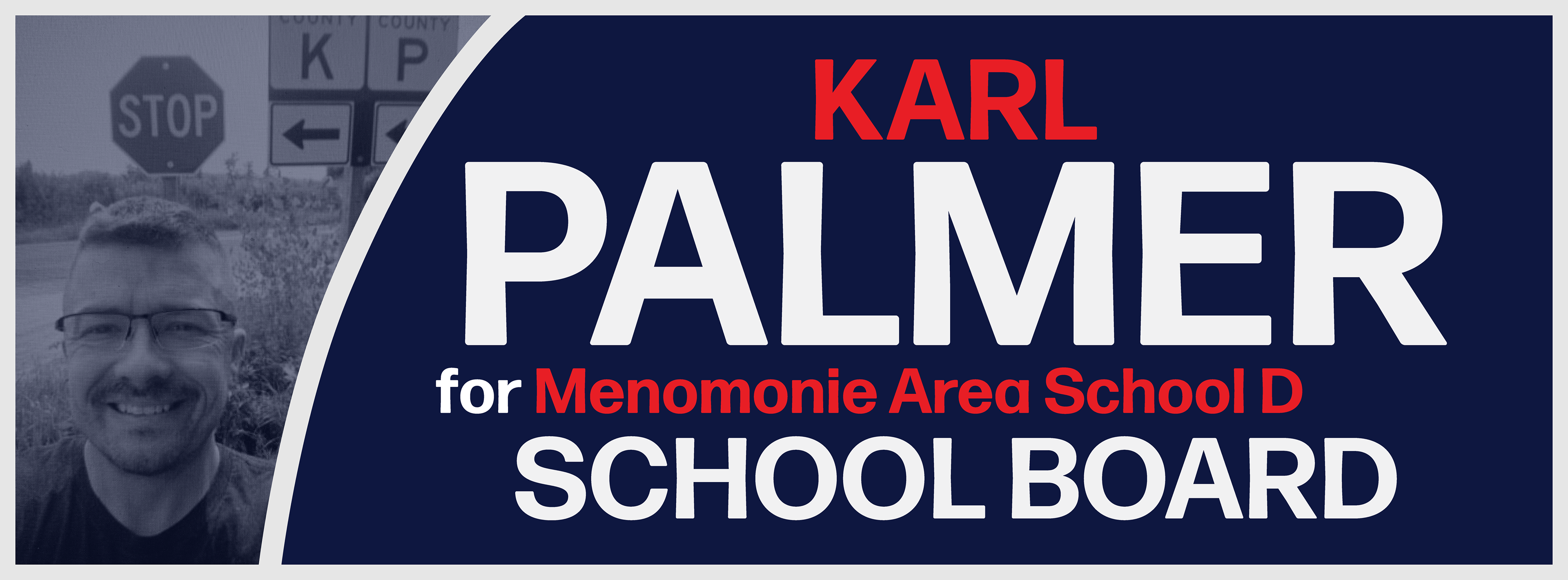
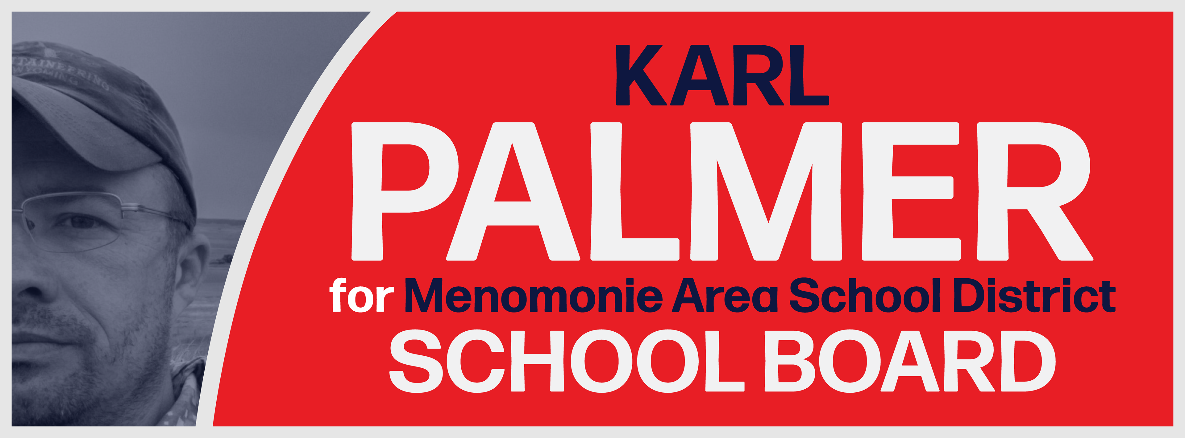
Facebook Banners